Some time has passed since the last post. In the meanwhile some interesting projects were born1
Between the draft of a recipe book created to organize some notes and the computation of Sardinia geographical centroid (improvised after the holidays), while reading on Wikipedia some pages on foreign cuisines, I wondered:
What is the most "famous" cuisine in the world (on Wikipedia)? 2 3
Put it like this, it’s a vague question. In detail:
- Cuisine: I mean national cuisines, ignoring regional ones
- Famous: define the popularity of a Wikipedia page is not easy4. I used the page length (in characters) in this analysis5
- Wikipedia: there are 303 active Wikipedias in multiple languages. The same cuisine, well documented in a language, may be only a stub (like a draft) in another one
In brief: I’ve tried to correlate cuisine page lengths (written in multiple languages) and to create an intuitive, easy-to-read visualization
Before discussing the technical side let’s see the results! :)
(Every graph is also available as interactive version, through the dedicated link. Best viewing on PC)
Heatmap (correlation matrix) of Wikipedia cuisines
 ↬ Link to the interactive version ↫
There are a lot of things to say on this graph! Before explaining how it was made, let’s see how to read it and what it means!
- Every column represents the cuisine of a specific country6
- Every row indicates a language (in which a Wikipedia exists)6
- Every cell corresponds to the Wikipedia cuisine page indicated by the column, written in the language indicated by the row (“Italian cuisine in English” indicates the Italian cuisine voice in the English Wikipedia)
- The color of every cell represents the length of the page (the color bar on the right is the key)
- The white dots in some cells highlight what in a pure correlation matrix (1:1) would be the diagonal: cells representing cuisines of the country X written in the main language of X7
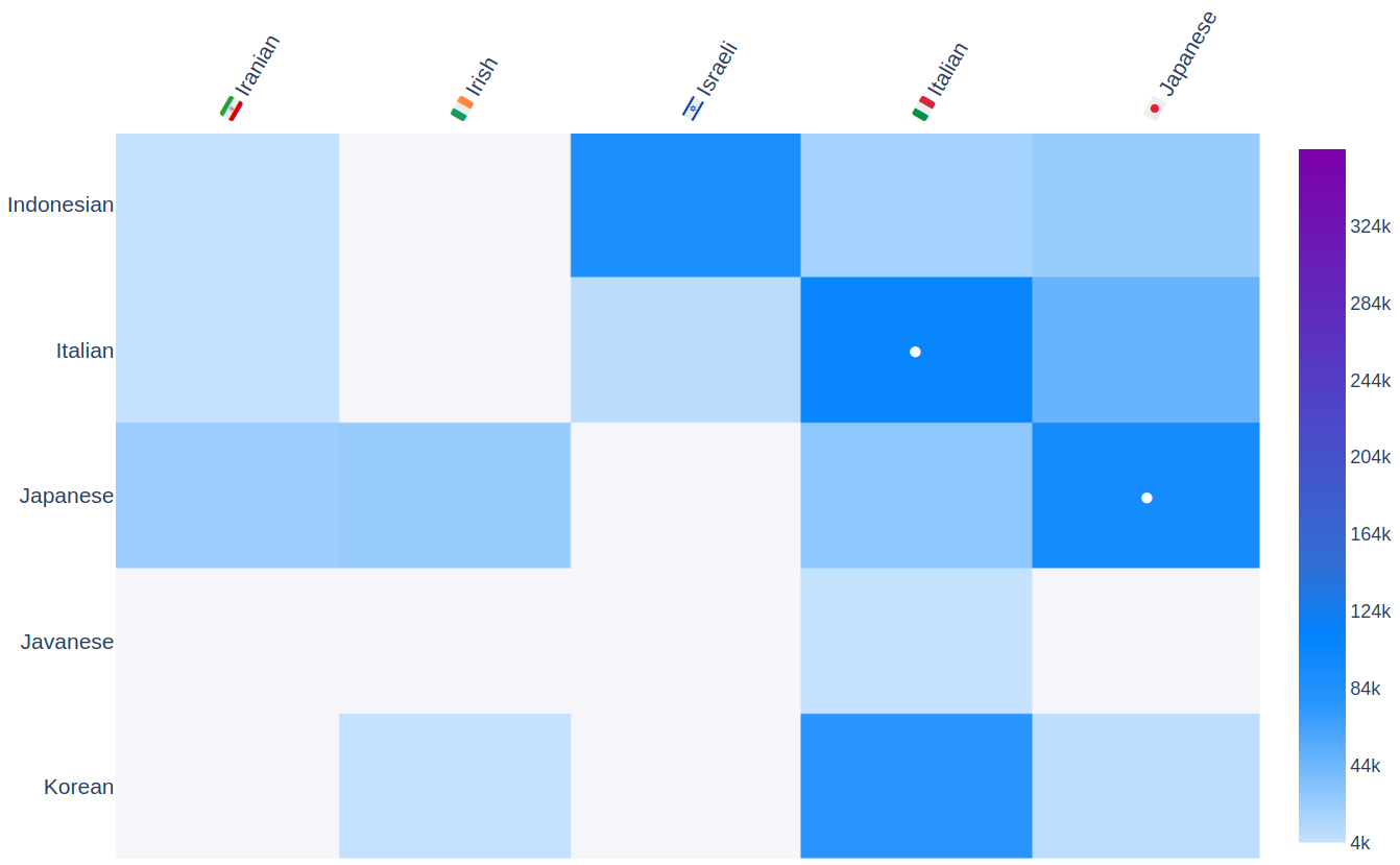
Let’s consider a small part of the matrix obtained zooming it (using the interactive version):

A couple of interesting things can be observed only from the color: the page on the Italian cuisine in Korean is quite long, as the page on the Israeli cuisine in Indonesian!
Unexpected famous cuisines
Exploring the heatmap, strange cuisine-language combinations can be found. For example:
- The page on the Greek cuisine in Greek (a “diagonal” entry) has a length of 25000 characters (more or less 7 A4 sheets printed using font size 12), but the page on the German cuisine in Greek is 93000 characters long! Maybe Greeks love German cuisine so much that they are not interested in their own?8
¯\_(ツ)_/¯ - The page on the Dutch cuisine in Polish is really long (130000 characters)!
- The page on the American (USA) cuisine in French (218000 characters) is three times longer than the page on the French cuisine in French! (70000 characters)
Remarks and disclaimers
- It goes without saying that the length of a Wikipedia page does not represent the sentiment of an entire country towards something. This analysis is clearly limited to Wikipedia. Also, there are some other factors to take into account:
- Some Wikipedias are more active than others and have (on average) longer articles
- Some voices are only simple lists, cases that best exemplify how the length is not an effective and absolute criterion
- Refining this analysis, the number of characters might be normalized over the average length of a voice in a specific Wikipedia. However, to know at a glance “how much a cuisine page is long”, I consider this normalization step not needed. I leave it to the curious reader to implement
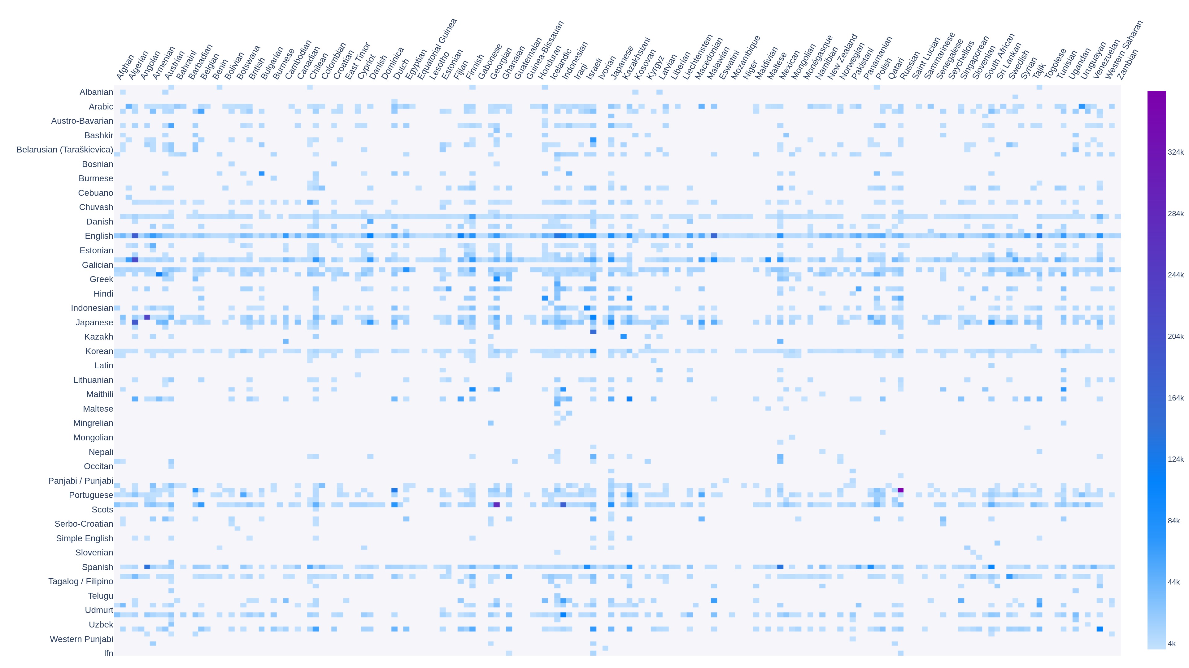
- In total there are 167 national cuisines9 and 119 languages10. The heatmap above is a filtered/reduced version (53×36)11. The entire correlation matrix is nice to look at but not quite readable. For those who are curious, the complete matrix (167×119) is the following:
↬ Link to interactive version (with labeled axes) ↫12

Statistics and podium 🏆
The following statistics are computed using the entire version of the dataset, without excluding voices or national languages (regional and local dialects were ignored)13
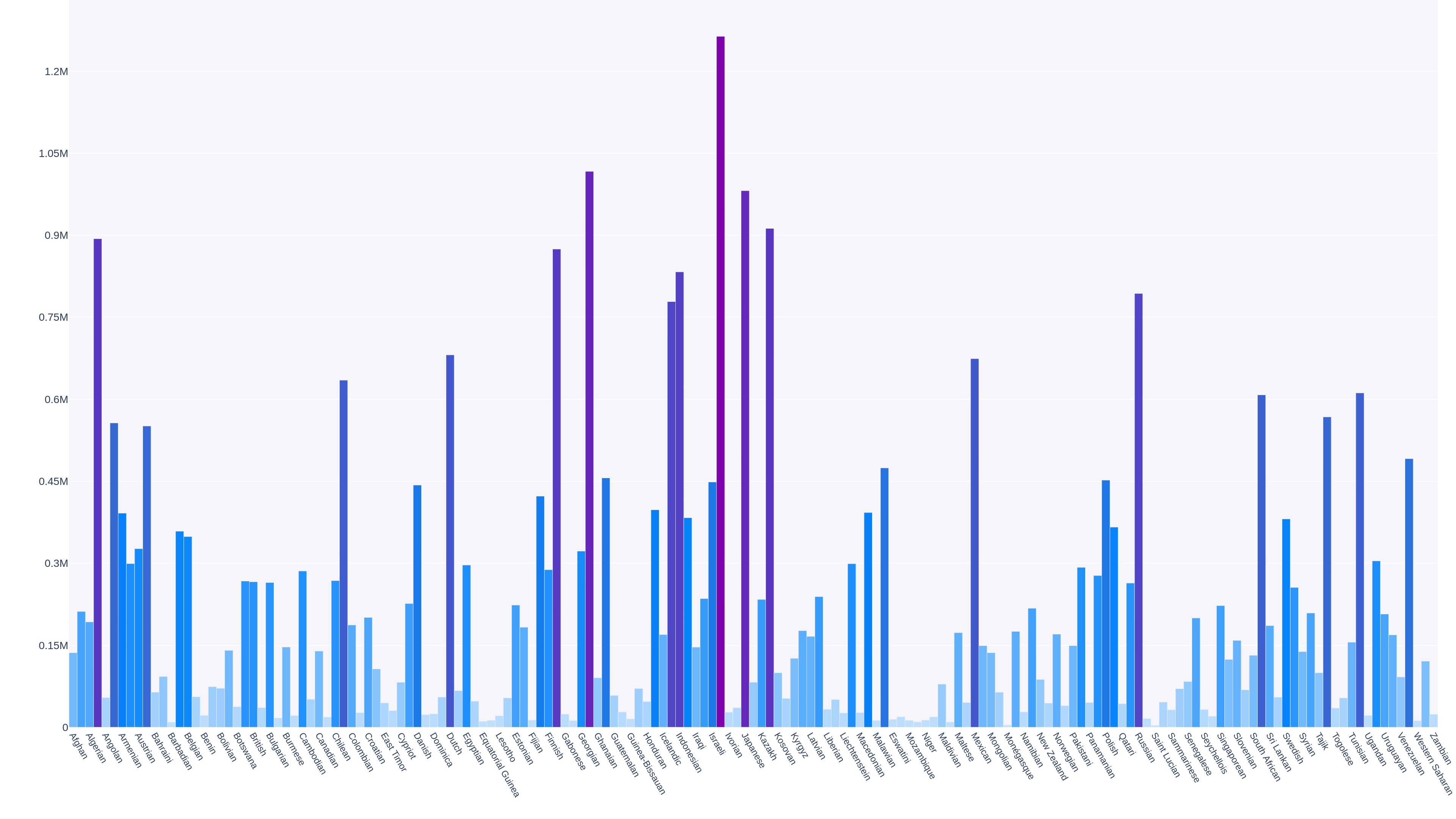
Most “famous” cuisines of the world (cumulative, on all languages)
↬ Link to the interactive version ↫

Adding up the page lengths of every cuisine for all considered languages, the following rankings are obtained:
| Cuisine | Length | |
|---|---|---|
| 1 🥇 | 🇮🇹 Italian | 1263679 |
| 2 🥈 | 🇩🇪 German | 1016720 |
| 3 🥉 | 🇯🇵 Japanese | 981386 |
| 4 | 🇰🇷 Korean | 912384 |
| 4 | 🇺🇸 American | 893520 |
| 6 | 🇫🇷 French | 874603 |
| 7 | 🇮🇩 Indonesian | 832875 |
| 8 | 🇷🇺 Russian | 793379 |
| 9 | 🇮🇳 Indian | 778534 |
| 10 | 🇳🇱 Dutch | 681041 |
In the first position, the Italian cuisine, with an overall length of 1.26 million characters! ![]()
The longest pages (independently from the language)
The top ten of longest cuisines (among all considered Wikipedias) is the following:
| Cuisine and language | Native title page | Length | |
|---|---|---|---|
| 1 🥇 | 🇷🇺 Russian (in Polish) | Kuchnia rosyjska | 363864 |
| 2 🥈 | 🇩🇪 German (in Russian) | Немецкая кухня | 279328 |
| 3 🥉 | 🇦🇷 Argentine (in Italian) | Cucina argentina | 227606 |
| 4 | 🇺🇸 American (in French) | Cuisine des États-Unis | 218192 |
| 5 | 🇺🇸 American (in Japanese) | アメリカ料理 | 190920 |
| 6 | 🇺🇸 American (in English) | American cuisine | 181443 |
| 7 | 🇮🇩 Indonesian (in Russian) | Индонезийская кухня | 175120 |
| 8 | 🇲🇾 Malaysian (in English) | Malaysian cuisine | 162794 |
| 9 | 🇮🇹 Italian (in Kannada) | ಇಟ್ಯಾಲಿಯನ್ ಪಾಕಪದ್ಧತಿ | 152911 |
| 10 | 🇦🇷 Argentine (in Spanish) | Gastronomía de Argentina | 140174 |
At the top, the longest cuisine is the page on the Russian cuisine (written in Polish), with 363864 characters! ![]()
A curiosity on the 9th place (just because I’m Italian)
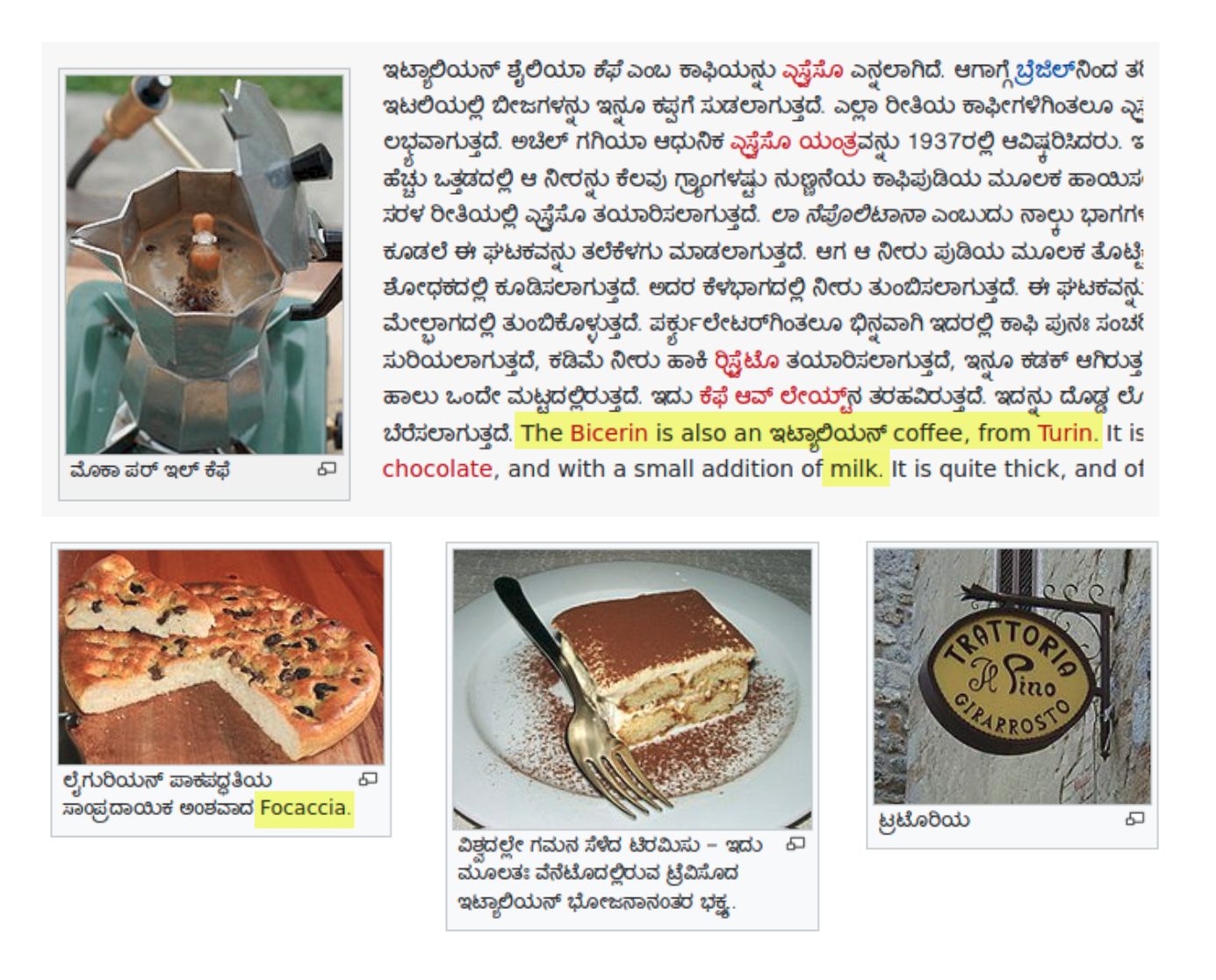
I wasn’t aware of the existence of Kannada (a language spoken in southern India), but it seems they are really interested in the Italian cuisine (ಇಟ್ಯಾಲಿಯನ್ ಪಾಕಪದ್ಧತಿ). As an Italian I think is wonderful to read something written in a completely different alphabet but at the same time find images of caffettiere (coffee makers), focacce and tiramisù:

Someone pointed out that the part on Turin bicerin seems untranslatable (“I think that there is a word for ‘latte’ (‘milk’) in Kannada”). But partial translation are common on Wikipedia, nothing too strange here! :)
The languages with most cuisine pages
↬ Link to the interactive version ↫

No wonder, the Wikipedia version with more cuisine pages is the English Wikipedia 🇬🇧
How was this analysis made?
To avoid a long digression on the implementation, I will only briefly mention the used packages and give an overview on data collection and processing. For those interested in digging more into this part, the repository of this project is on GitHub
Used packages
The entire project is developed in Python. The main packages used (handled using Poetry) are the following:
| Package | PyPi page | Description |
|---|---|---|
beautifulsoup4 |
🔗 | Handle/parse low-level HTML14 |
pandas |
🔗 | Must-have to store and analyze data |
emoji |
🔗 | Needed for emojis, used for national flags |
plotly |
🔗 | A must-have to create visualizations/plots15 |
Download and data processing
There are 4 steps of data preparation. At each step, the same data structure is enriched with more and more information.
The functions (that represent the steps) are the following:
-
step1_prepare_cuisines_data
The list of all “cuisine candidates” is created starting from this Wikipedia template. Redirects are ignored and only national cuisines are taken into account. Wikipedia page IDs are also stored -
step2_populate_other_languages
For each cuisine in the list, translations in other languages (except English) are identified. Titles and URLs are saved -
step3_fill_lengths
Needed page lengths are obtained through API calls -
step4_preprocess_data_frame
The data structure is converted from dictionary topandas.DataFrame. During this step, a filter is applied to reduce data size. The obtained data frames are saved:table_dataframe.dat(filtered version) andtable_dataframe_full.dat(complete version, used to compute overall statistics)
Visualization and graphs
A final step (step5_create_plots, in visualization.py) loads the previously created data structures to create graphs, tables and stats that are saved in images, HTML and Markdown
Conclusions
This whole analysis was made just for fun, out of curiosity and to do something new. That being said, I’m happy of the results! It’s really interesting to look for strange correlations in the heatmap, discovering new cuisines and languages that I didn’t know about!
If you find something curious or want to create similar statistics to a different Wikipedia category, let me know or try directly by yourselves (the code is as always open-source (repository su GitHub) and it’s released under MIT license)
Things (still) to do
Since when I started writing this article some improvements and new graphs to make have come to my mind. I’m happy with the current status, but in the future I would like to implement (by importance/relevance):
- Automation of data collection/analysis step16. Wikipedia pages change really often, this analysis may be already obsolete in a couple of months17
- Statistics to highlight longest cuisine pages for each language, excluding diagonal entries
- Normalization of lengths, to make pages “stand out” with respect to the mean length of the page for that Wikipedia edition
- Take into account local languages, trying to use a similar approach for Italian dialects18
Thanks for reading, see you next time! :)
-
ITAQA is going on and I have new things to talk about! I hope to write about it soon ↩
-
Narrow it down to Wikipedia simplifies a lot everything! ↩
-
I already had a guess, but I wasn’t able to prove it (yet) ↩
-
A collection of interesting voices is “featured articles”, but it only classify in “interesting” vs “not interesting” ↩
-
As explained later, I know that the length of a page is not a certain measure of its fame. Also it was pointed out that different languages have different information density ↩
-
Yes, I know, a lot of countries and languages are missing, I will explain later ↩ ↩2
-
Note that on some rows there are multiple dots, indicating all countries where that language is the main one. On this regard: some countries have more than one main language (Switzerland, Luxembourg, Belgium), in which case multiple dots on the same column should be marked. This higher level of detail is not implemented (yet) ↩
-
A dear friend of mine (who loves Greek cuisine) commented: “there is really little to say on their cuisine, it can be summarized in: feta, moussaka, gyros, i cosi con la vite, olive. Stop.” ↩
-
Namely, all the national cuisines that are listed in the English Wikipedia ↩
-
Namely, all the languages that have at least a voice on one of the national cuisines taken into account ↩
-
I ignored all voices shorter than 4000 characters, all cuisines present in less than 13 languages, all languages with less than 14 cuisine pages and all Wikipedias in local dialects ↩
-
The interactive version has on the language axis some language prefixes not converted in the language name. It’s still interesting to navigate! ↩
-
All statistics and graphs are based on the situation on October 4th, 2020 ↩
-
Initially I planned to do the parsing/data download using the
wikipedia(🔗) package, but currently is incomplete and not optimized. For this reason I switched to the low-level approach withbeautifulsoup↩ -
I think that
matplotlibis a little bit outdated and a blob, there are some alternatives (likeplotly) that are lightweight and natively interactive/modern. I have still to tryseaborn(website), I’ve read some nice thing ↩ -
Maybe using directly GitHub Actions (I don’t know how much it would be feasible, but I want to try it) ↩
-
Since when I started to write this post there was already a change to make: the German cuisine overtook the Japanese one, moving on to the second place, after a big expansion of the page “German cuisine in Russian at the end of September ↩
-
But I’m afraid that local-dialect Wikipedias are too small, I don’t think they contain a lot of information on the cuisines of other regions ↩